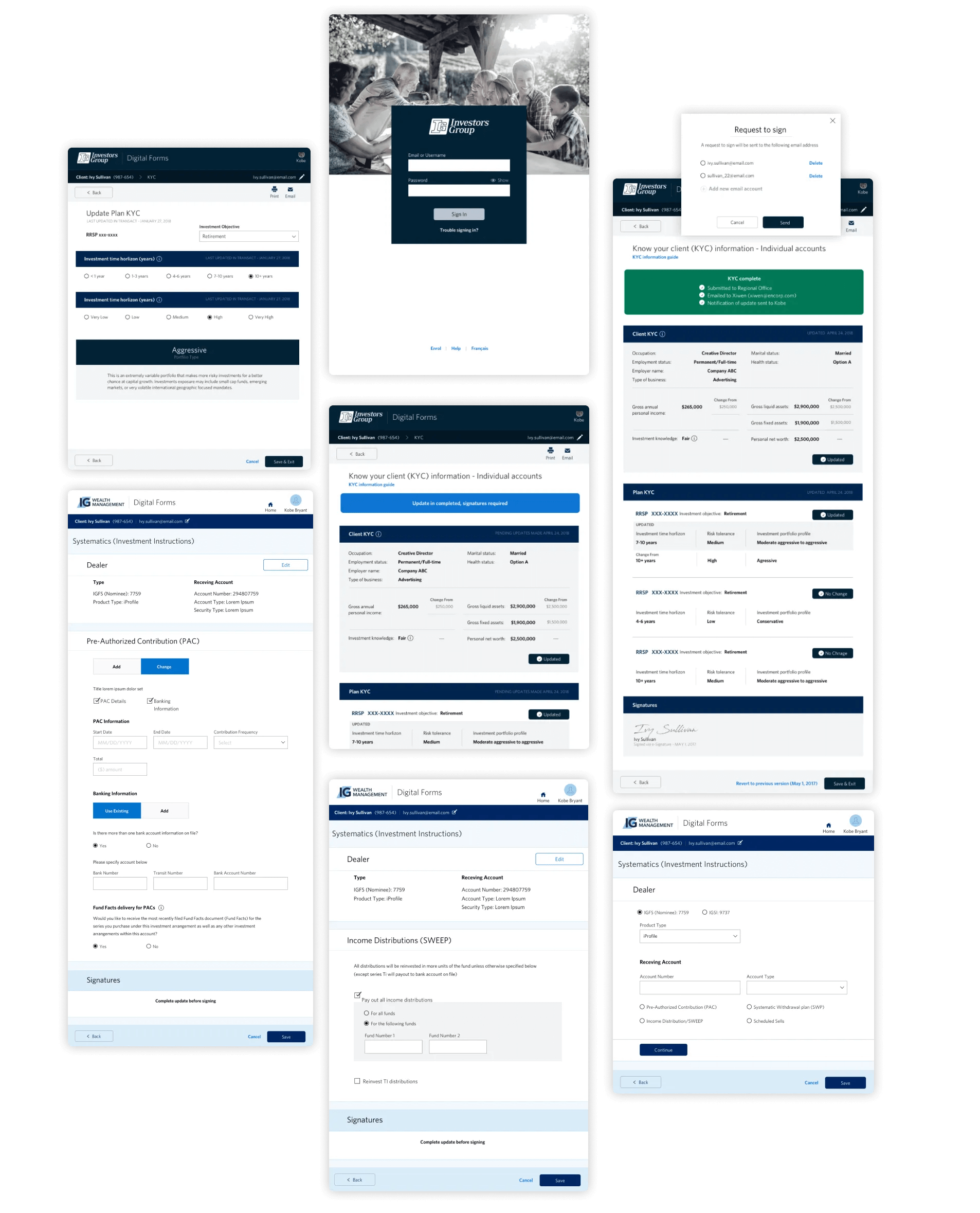
Utilizing IG design system base form styles
Testing our user repository
During the course of our project, we conducted testing sessions and actively sought feedback to ensure the effectiveness and utility of the forms we developed. The outcomes were remarkable, as each advisor demonstrated genuine interest in the newly created process and eagerly anticipated implementing it with their clients. The positive reception and enthusiasm from the advisors affirmed the value and impact of our work.
Streamlining client planning
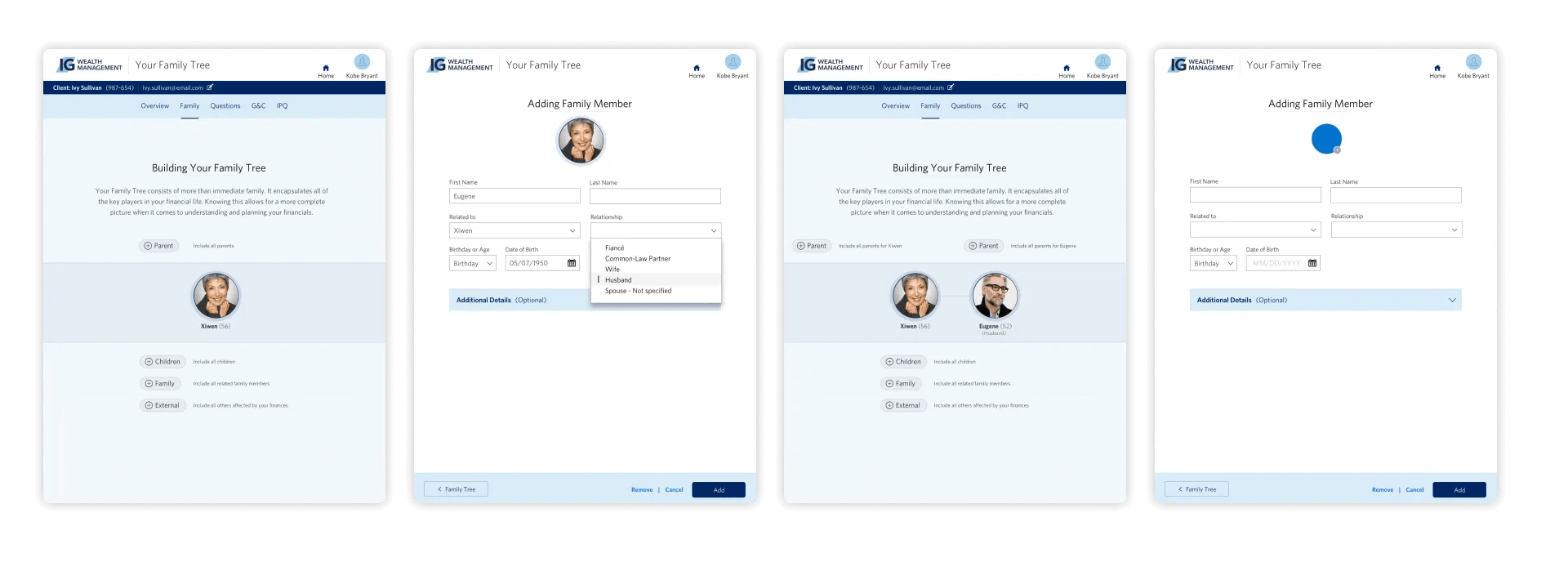
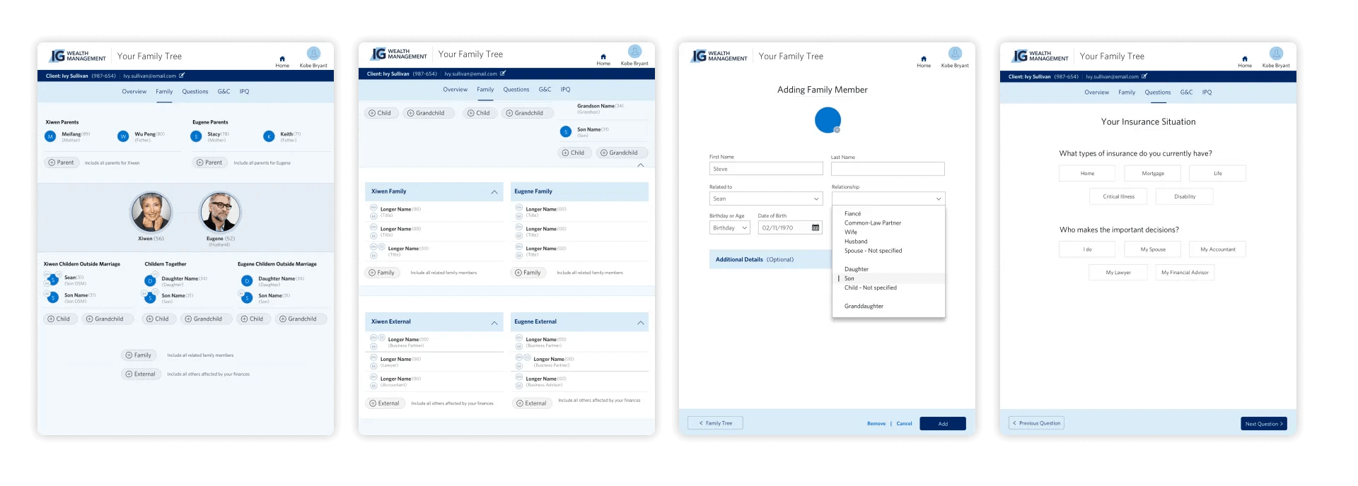
While testing our standard forms, I noticed a significant variation in the way advisors kept notes and tracked family trees. Some assigned individuals to handle these tasks, while others stored notes within files or documents, lacking a standardized approach. All advisors acknowledged their method was not ideal and needed improvement. To improve the process, it was unanimously agreed that a family tree would facilitate future planning, tracking, and goal-setting. Advisors would be able to effortlessly track and update family members' information, making it easier to plan for their clients' future needs. This improvement would streamline the overall process and ensure more effective client management.
Transforming user feedback into innovative design
Based on the user testing insights we collected from our standard forms, I spearheaded the UX&UI efforts to create an enhanced experience. During our discussions with advisors, we identified a significant opportunity to organize client goals based on two key data points: family and time. This approach would significantly improve our ability to gather and expand clients' family trees over time. Drawing upon this valuable insight, I developed wireframes that visually represented the proposed changes.
Researching the future of Client-Advisor interactions
Designing an immersive and user-friendly experience for advisors and clients was a challenging endeavor. We conducted an extensive day-long testing session to evaluate our high-touch forms and family tree. We actively sought opportunities to test our product with a wide range of advisors, visiting their offices and conducting interviews to gain valuable insights into their workflows and identify areas for improvement. This was followed by testing of our forms and family tree, analyzing their feedback to help guide the journey.
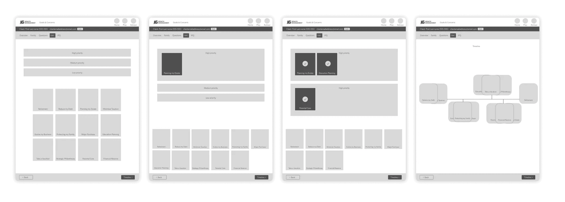
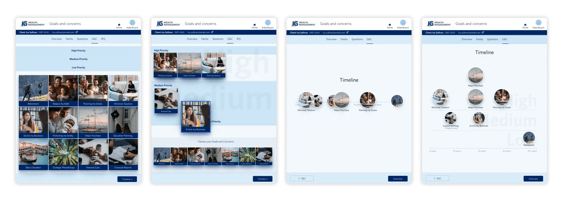
Goals and concerns wireframe
The insights from the interviews were invaluable, with overwhelming positive reviews from advisors and the Director, expressing eagerness to use the application with clients. Following the testing session, we received invitations and inquiries from other offices, showing great interest in participating in future sessions.
Creating seamless and engaging client experiences
Extensive research and analysis revealed advisors' preference for an interactive and engaging approach, which significantly improved conversation flow, effectiveness, and ultimately enhanced the overall client experience.
During our observations, we noticed that advisors had diverse preferences regarding accessing the application. Some preferred using an app-based format, while others desired compatibility across laptops and iPads. Taking this into consideration, we developed a comprehensive online application that met the approval of our technology and security teams. This solution catered to advisors who used different devices, resulting in a user-friendly and efficient platform that surpassed expectations and effectively addressed the needs of both clients and advisors.
Redefining the introduction experience
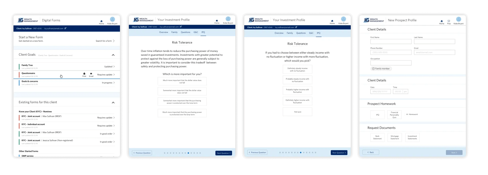
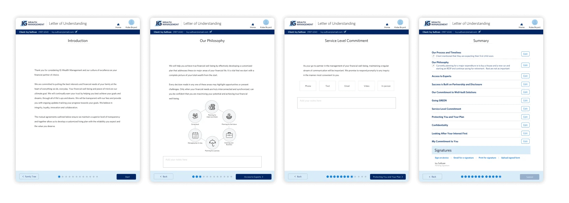
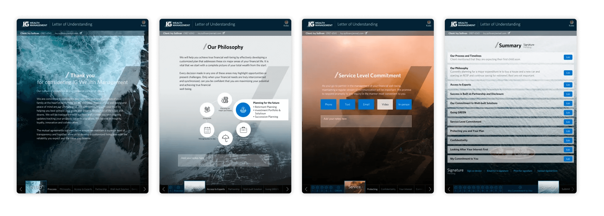
In response to the business's request to use our standard form style for the introduction to IG Wealth Management, we acknowledged that this style was originally intended for regular business forms and did not meet the design standards required for high engagement experiences. To illustrate the advantages of expanding the visual definition and enhancing the user experience, we initiated the process by showcasing our baseline form style. Subsequently, we provided demonstrations on how specific forms could be refined and customized to align with different stages of the client journey, underscoring the potential benefits of these improvements.
Enhancing the first client interaction
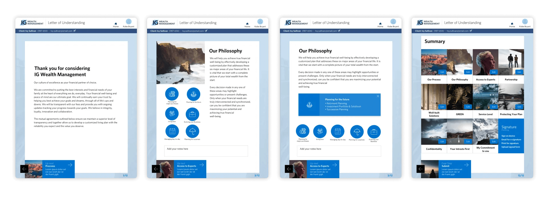
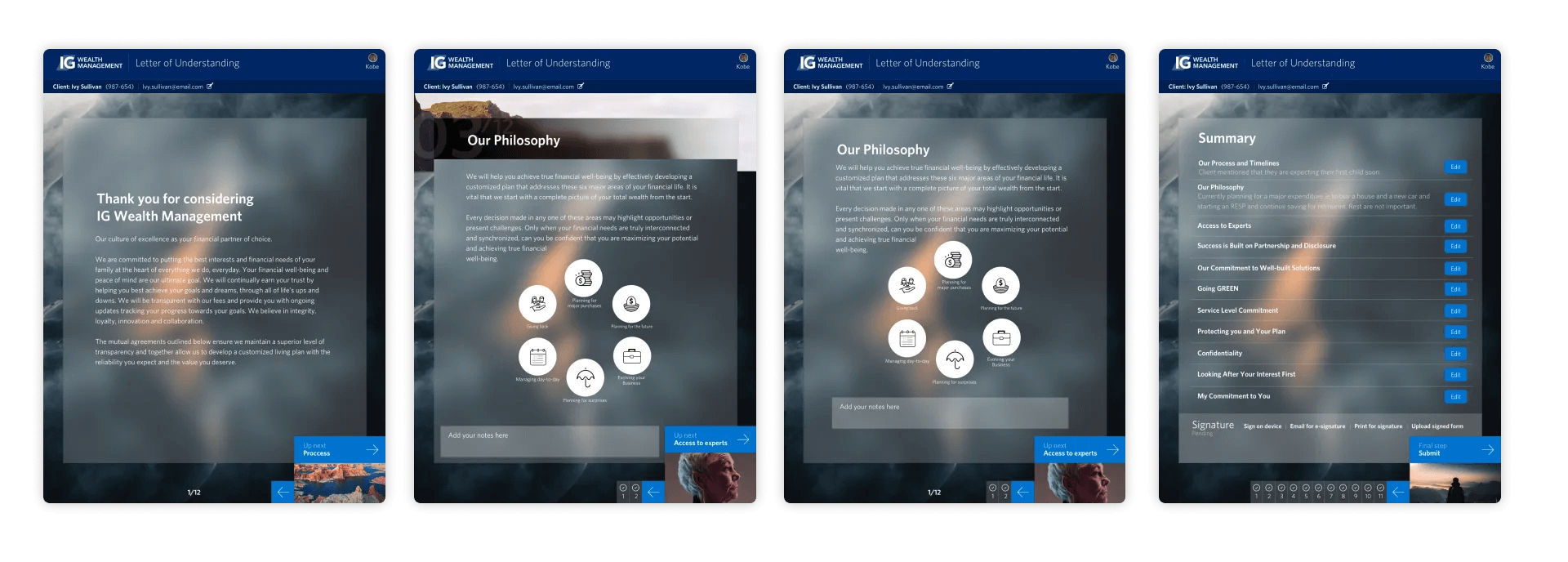
Using past experiences and insights, we explored three options to enhance the IG Wealth Management form design system. Our goal was to leverage the existing design system style and create captivating forms with effortless navigation for advisors and clients.
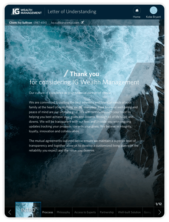
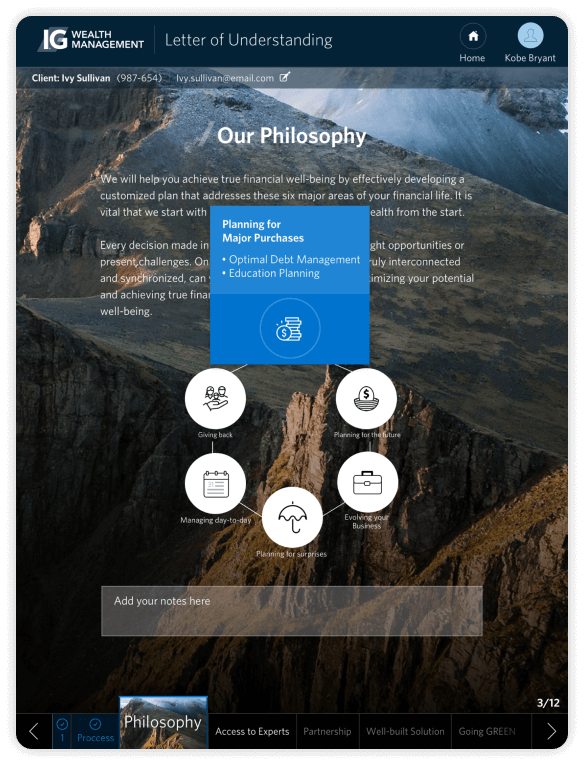
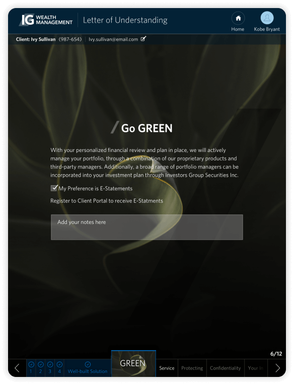
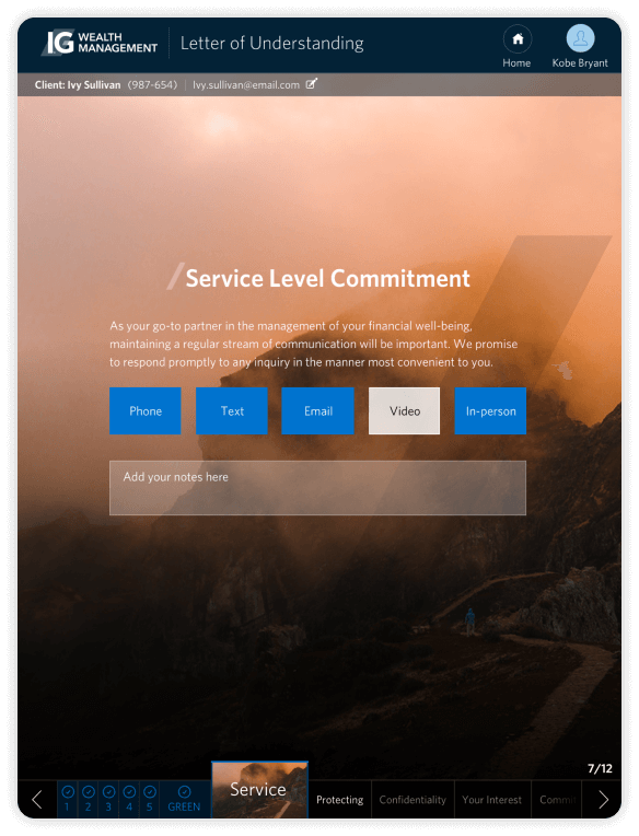
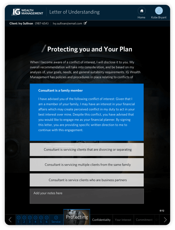
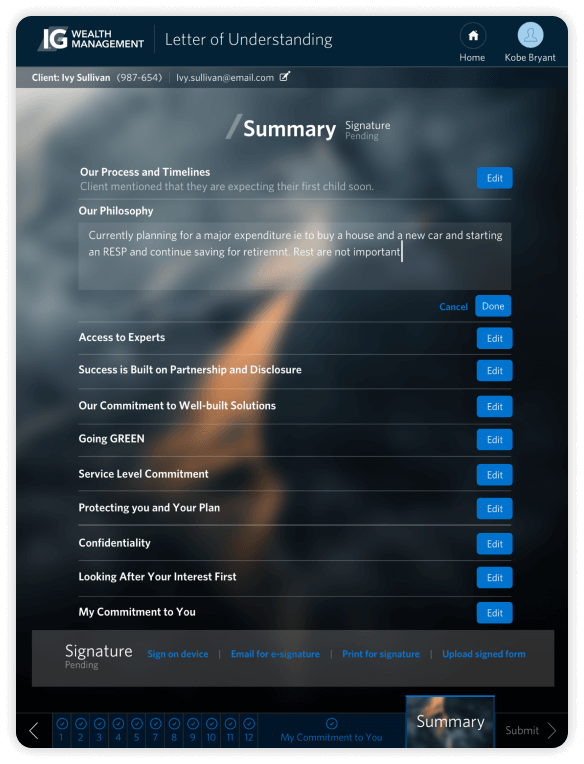
The goal of creating engaging and easy-to-navigate forms, several versions of the Letter of Understanding were designed and tested. The aim was to create a comprehensive high-touch form that provided a clear understanding of the number of steps involved. Through testing, it was found that presenting the number of steps involved was preferred over a more limited version. The feedback from advisors was overwhelmingly positive, indicating that the approach was successful.
Elevating client experience through visual storytelling
Due to time constraints, we had a limited sample size of eight participants for testing, with four participants allocated by our UX product partner. To ensure a diverse range of perspectives, I personally tested the remaining four participants, each representing a potential mass affluent client. Despite the small number of participants, the feedback we received was overwhelmingly positive, with participants highly appreciating the overall experience. The high touch forms, in particular, garnered praise for their exceptional engagement. The visual representation provided a valuable guide during conversations, a departure from the predominantly numeric-oriented forms they had encountered previously. This feedback offered valuable insights from the client's perspective.
Our strategy for testing and scaling
We successfully delivered the Minimum Viable Product (MVP) accompanied by comprehensive documentation for future planning and journey mapping, aiming to elevate the application with defined goals and timelines. We closely monitored and evaluated its performance in the field over a specified duration, starting with a small group of advisors. Based on the results and feedback obtained through a survey, we progressively expanded the testing pool size by certain percentages, allowing for a broader assessment of the application's effectiveness. Our diligent efforts in delivering the MVP and conducting thorough evaluations have positioned us for ongoing development and improvement, ensuring an exceptional user experience for advisors and clients.