A comprehensive system overhaul
Assigned with the responsibility of converting a campaign design into a comprehensive design system for MVP pages and product pages. Collaborating closely with UX to gather requirements and insights, conducting iterative design sprints, and leading the UI initiative.
Before launching a large-scale redesign, our objective was to showcase the business benefits of implementing a design system. We focused on analyzing the pain points of the older site, which lacked responsiveness and hadn't undergone a substantial architectural update in several years.

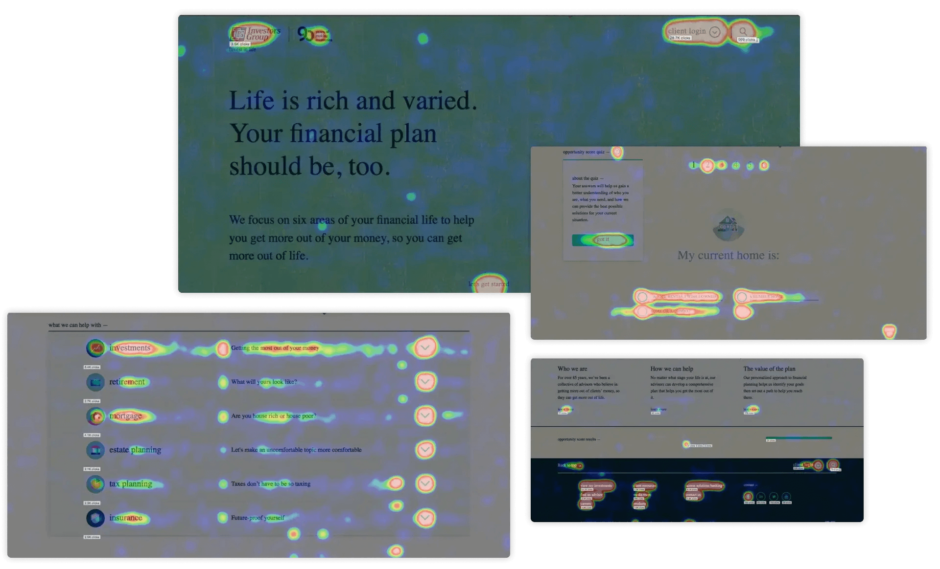
Source: Heatmap of campaign pages
Research
Collaborating closely with UX, we conducted comprehensive audits to assess AODA compliance and analyze the competitive landscape. UX conducted valuable heatmap analysis and user testing to gather insights, which guided our enhancements to the page designs. The results were impressive, with 3,178,618 unique pageviews tracked.

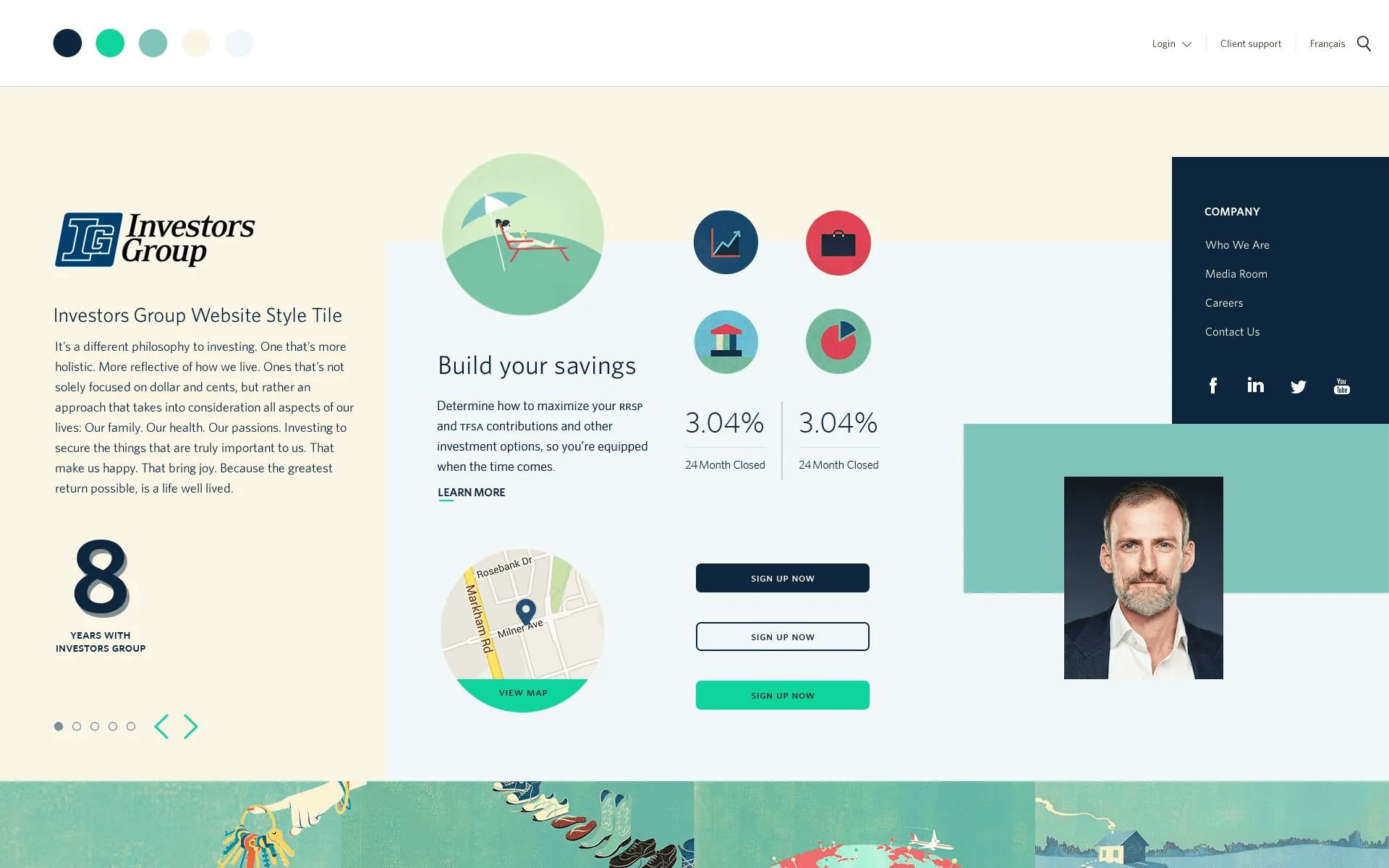
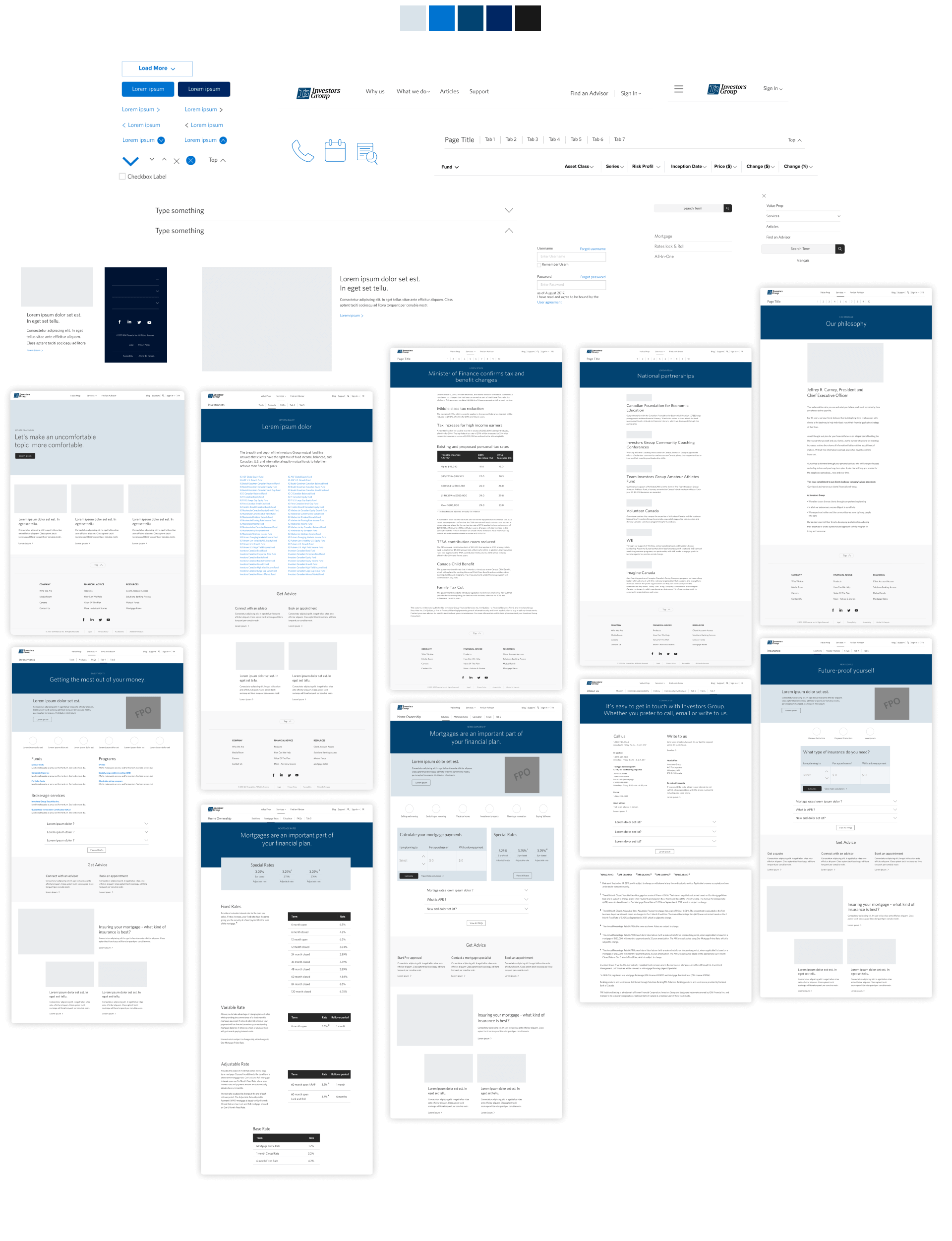
Style Tile

Foundational cleanup, updates and expansion
Expansion
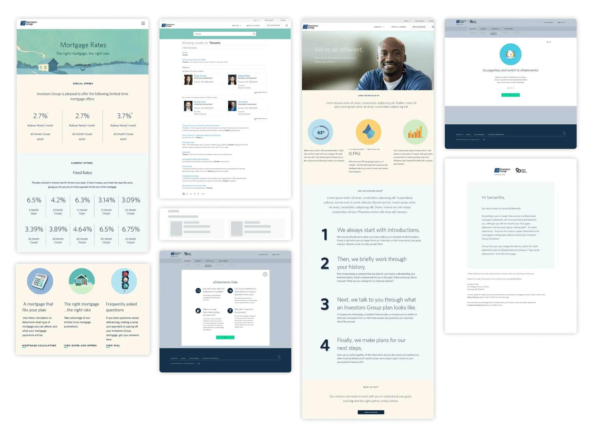
We embarked on a process of updating and incorporating design system styles into additional MVP pages and product pages to establish a cohesive visual identity across the most frequently visited pages by clients and advisors. By reimagining and leveraging the live campaign style, we expanded its elements into components, thus establishing improved UI standards throughout the entire site.

Design system - Sample set
Foundations
We extended the designs to encompass the entire site, paving the way for the creation of IG Wealth Management's first design system. This initiative highlighted the advantages of adopting a systematic approach and building reusable components. By reimagining and incorporating the live campaign style into component-based elements, we established enhanced UI standards throughout the entire site.
Key Learnings
80%
Of users landing on the page would not scroll and immediately leave
42%
Reduced bounce rate, and increased engagement on page
70%
Of users scrolling from the hero section increased to 78% of the page

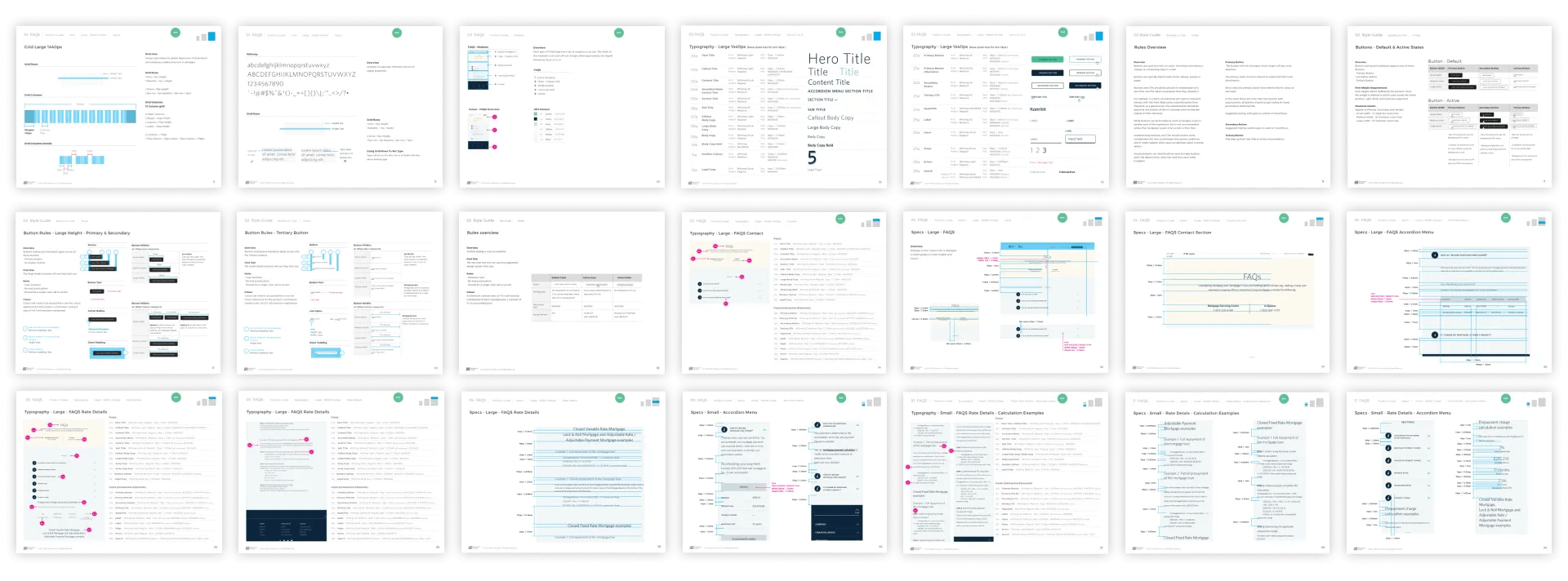
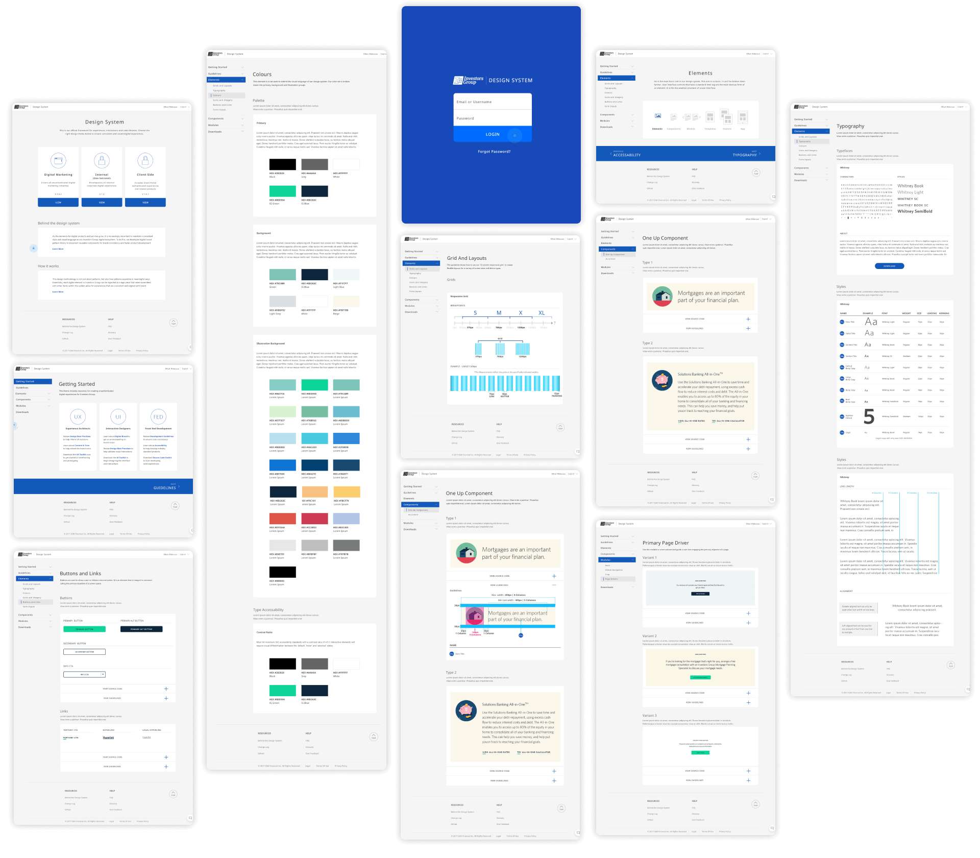
Custom digital design system - Sample set
System
We encountered a significant challenge related to licensing the art and fonts utilized in the original campaign on the website, which reached a critical point in the new year. As a result, we accelerated our timeline and implemented a redesign. To streamline our workflow, we developed an in-house repository that offers easy access to new team members and remote freelancers.
Elevating the user experience
With only a three-month timeframe remaining until launch, we collaborated closely with our UX team to perform a thorough content audit. Simultaneously, we engaged in discussions with our business partners to assess the relevance and requirements of the content. As a result of this process, we successfully eliminated over 1,400 pages. Our launch strategy was meticulously planned, and we divided it into essential phases to ensure its effectiveness.

Design system updates
The art of adaptability
We were in the process of refreshing our brand, which presented multiple potential directions to consider. The finalization of the brand was not achieved until two weeks before the launch. To ensure a successful outcome, we collaborated with our UX team to establish a comprehensive plan for testing and validation throughout the development process. Our war room became a hub of activity, with daily updates posted on walls and boards, providing a transparent view for business updates and facilitating walkthroughs for all team members to easily grasp every detail at a glance.

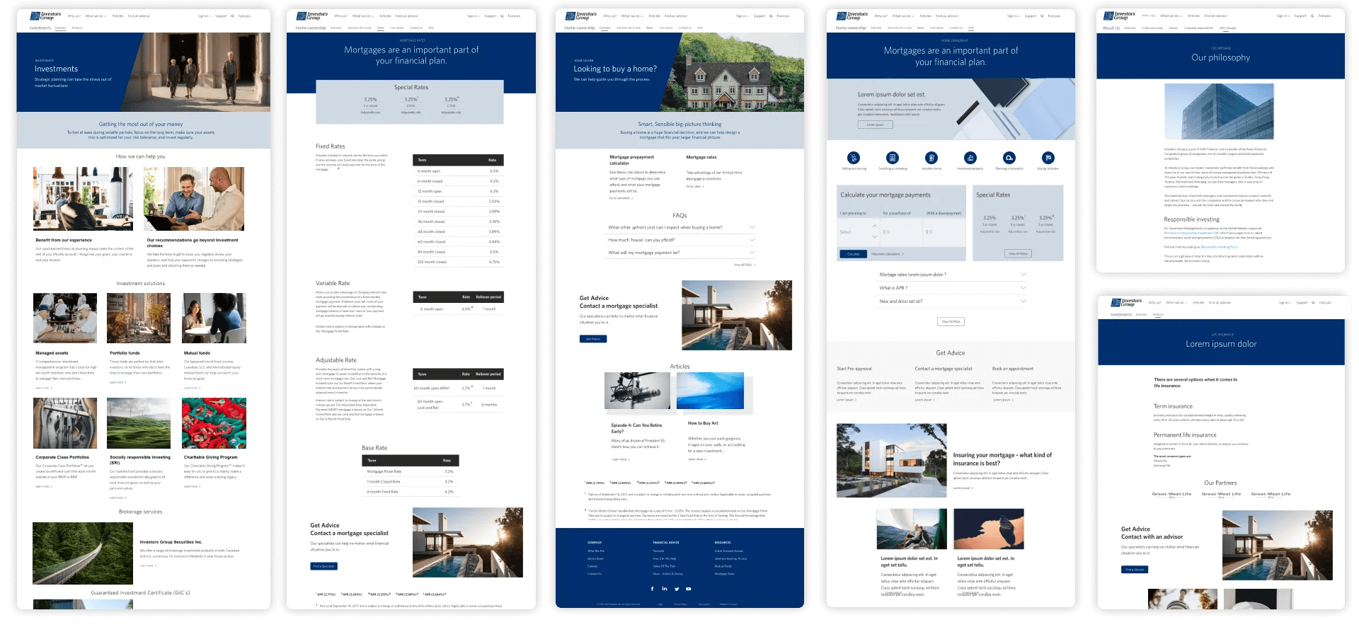
White label branding
Navigating a challenging schedule
Our minimum viable product (MVP) centered around developing a streamlined design system that could be rapidly adapted. Considering the time constraints, we made the decision to create a white-label version since full implementation of the brand was not feasible. With a significant number of pages to convert, we identified the MVP pages and provided essential guidance on typography, color, and alignment for the remaining pages. The finalized brand arrived just two weeks before the launch, which we promptly incorporated within a few days. Rigorous testing of the updated pages ensued, ensuring a successful and timely launch. As the Lead UI, my primary objective was to demonstrate to the business the effectiveness and necessity of a comprehensive design system, highlighting the advantages of adaptable and updatable components. With a highly skilled team, I had full confidence that we would deliver a product that surpassed expectations.
Designing with purpose
Following the triumphant launch of our design system, our brand is now fully operational. Collaborating closely with UX, we are conducting comprehensive testing and actively searching for any opportunities to further refine our system before embarking on the exciting journey of implementing the new brand.

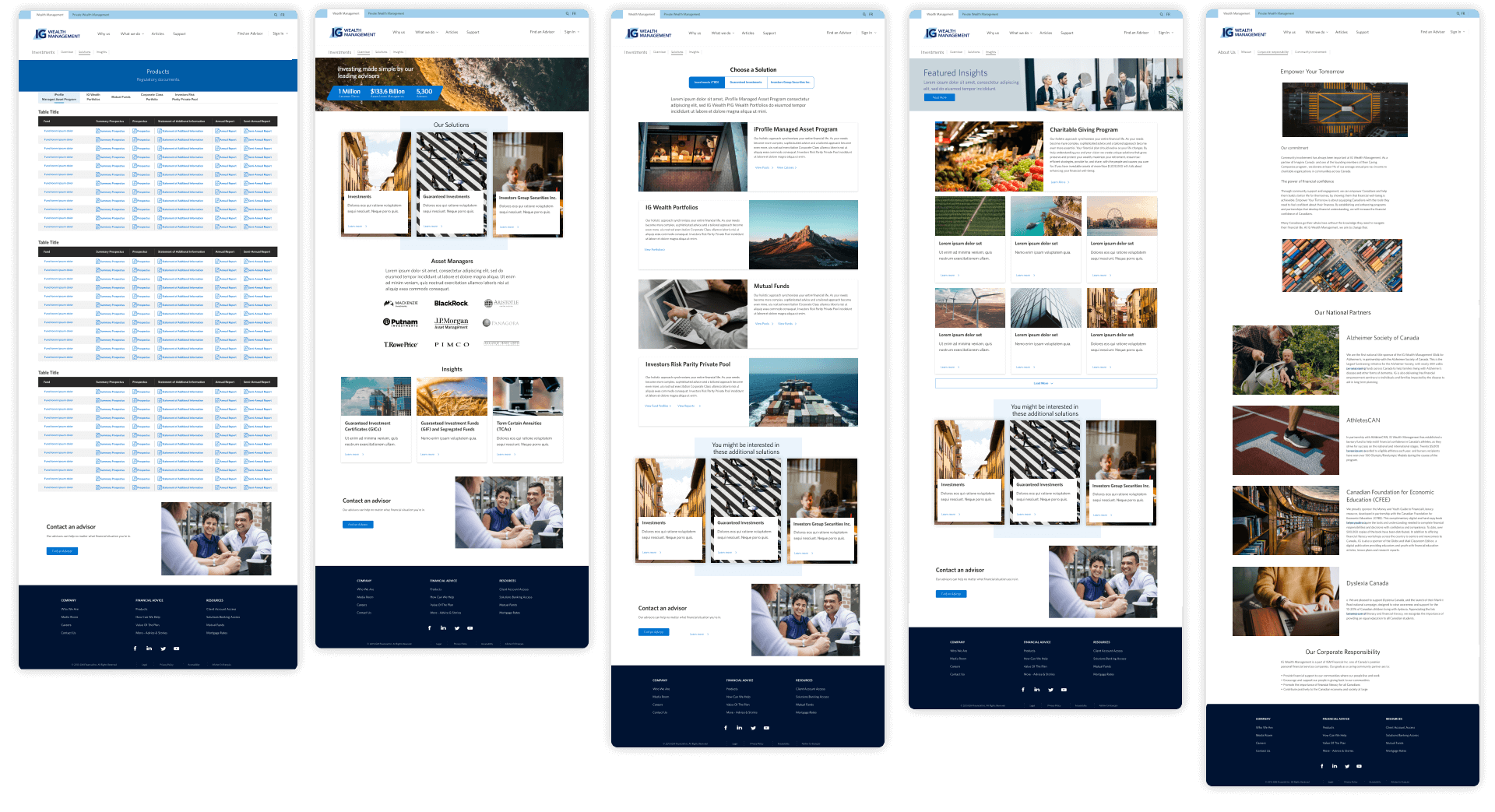
UI brand updates
Telling our brand story
After identifying key areas and hero pages that demand additional focus, we devised a straightforward plan: leverage the achievements of our initial implementation, thoroughly test our designs, and execute the necessary enhancements. With the aid of AEM (Adobe Experience Manager), we seamlessly integrated these components, font variations, and color updates across the entire site.
