Setting a baseline
We held mini design sprints and workshops with the business, utilizing brainstorming sessions to create categories, products, pain points and insights that would inform our affinity mapping and card sorting sessions. These session were extremely valuable to help us better understand the business and gain insights into pain points and in setting our base line.
Advisor interviews and testing
We arranged interview sessions with a selection of Mackenzie's most successful advisors. By employing Cognitive walk-throughs, we tested potential solutions and received valuable feedback regarding their day-to-day requirements. Conducting user testing played a pivotal role in the insights we obtained, influencing our decision-making process and leading us to explore new directions. To comprehend the needs and challenges of our target audience, we conducted thorough research. This included surveys, focus groups, and interviews, which provided us with valuable insights into their banking habits, preferences, and sources of frustration. This extensive research enabled us to identify crucial areas for improvement and establish clear project goals.

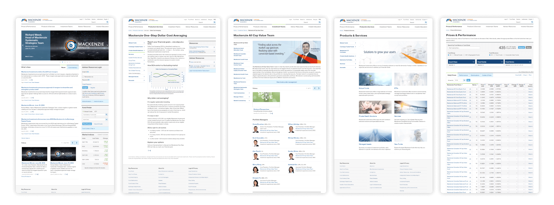
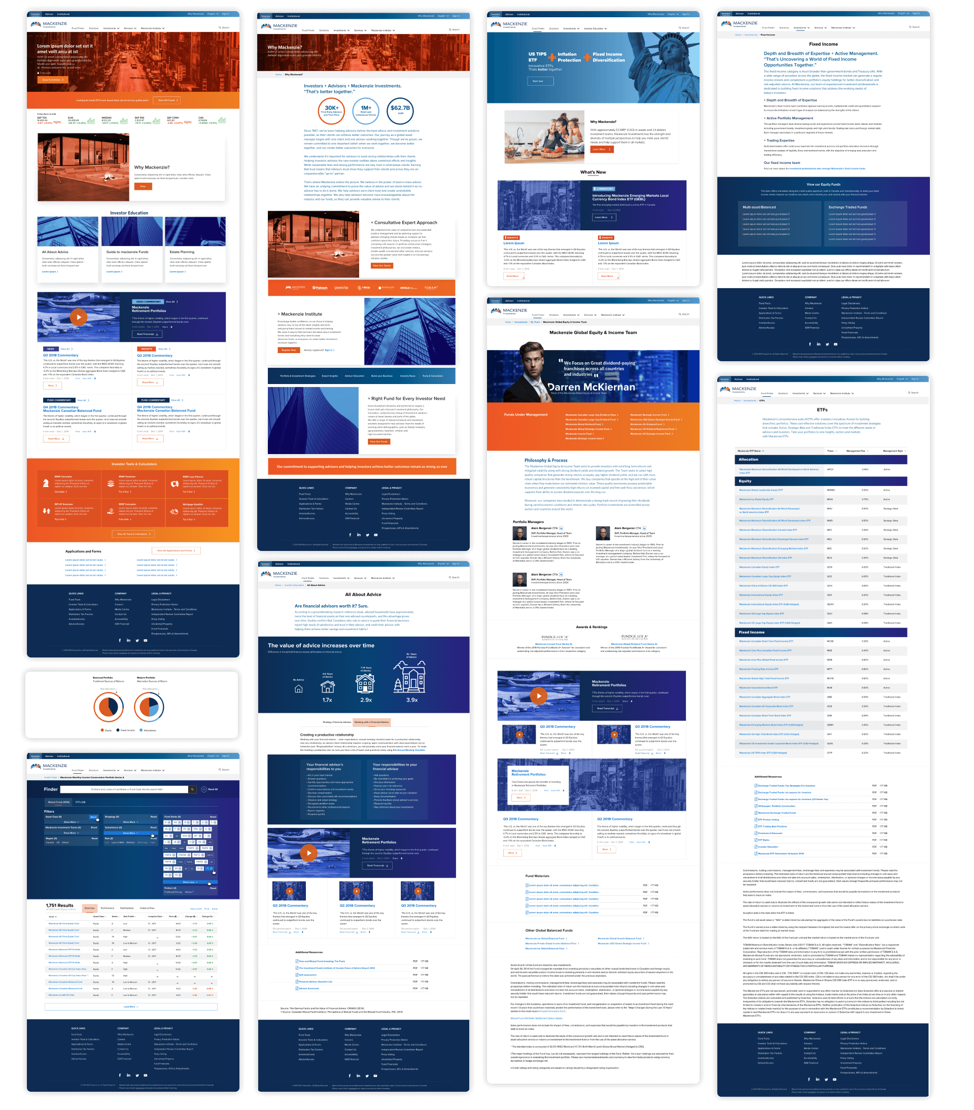
Source: Original Mackenzie website
Taking a step backward to leap forward
We conducted a comprehensive audit of Mackenzie's pages, examining their lifespan and future vision, with a focus on the goals for our clients and partners. We created a roadmap for the minimum viable product (MVP) with multiple phases, including a product sitemap, user stories, wireframes, and final designs. Throughout this process, we actively involved our business partners, taking them along the journey from requirements gathering to wireframe and design approval. By understanding how the business perceived design, we had an opportunity to educate our partners and include them in the decision-making process. We started by presenting style tiles, visually demonstrating how design can shape and form various visual directions, allowing Mackenzie to establish its unique visual language and voice.
Unveiling a captivating brand
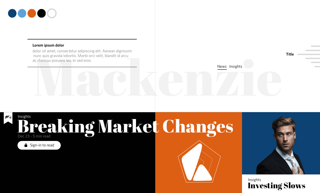
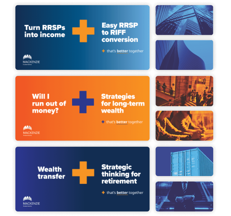
As our agency partners embarked on developing a campaign to launch Mackenzie, they also took the opportunity to create a new brand direction that has the potential to redefine our organization and propel us into an exhilarating new chapter. Our objective is to seamlessly integrate this style into our user interface (UI), with the aim of captivating our audience and positioning Mackenzie as a force within the industry.

Source: New branding, supplied by agency
Transforming the digital landscape
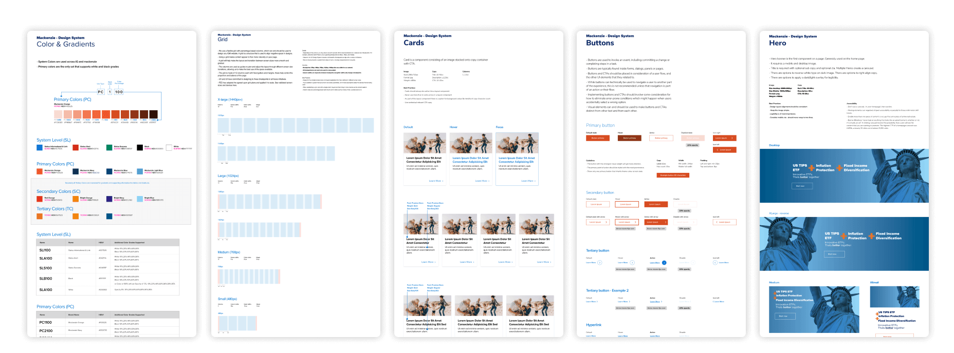
Through a strong partnership with our business counterparts, we meticulously planned a roadmap for Mackenzie's future. Simultaneously, we collaborated closely with our development team, who diligently prepared the new development environment in AEM (Adobe Experience Manager). Given the challenging timeframe of just two months, we devised a well-thought-out strategy for transitioning pages that couldn't leverage the styling of the existing live site. To ensure steady progress, we established a baseline design system that enabled us to complete the porting tasks while simultaneously refining Mackenzie's fresh digital identity. This approach ensured our unwavering focus on the redesign initiatives.

Baseline design system - Sample set
Defining the ecosystem
The Mackenzie sister site had already adopted AEM under my previous leadership. To enhance the overall user experience, we implemented a phased approach. In phase one, we leveraged AEM components from IG Wealth Management to transition Mackenzie onto the AEM platform. Phase two involved a redesign process, incorporating additional branding elements once we had established our baseline design system. Our focus was on creating a compelling visual direction that would position Mackenzie as industry thought leaders and effectively showcase our expertise.

Phase 1 Mackenzie redesign - Sample set
Increased productivity
After our initial redesign, we observed a significant boost in productivity for BAU (Business as Usual) production work. This improvement had a dual impact. Firstly, pages that necessitated only text updates no longer had to await a code push. Secondly, every essential baseline component required for executing requests became readily accessible through a simple drag-and-drop functionality within AEM. This streamlined process facilitated efficiency and expedited the execution of tasks.
Evolving the brand's visual language
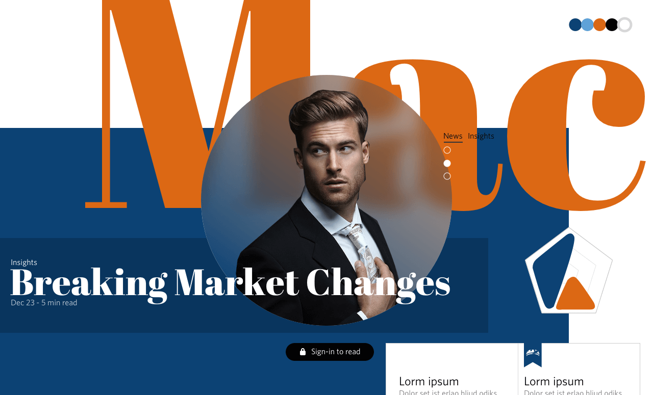
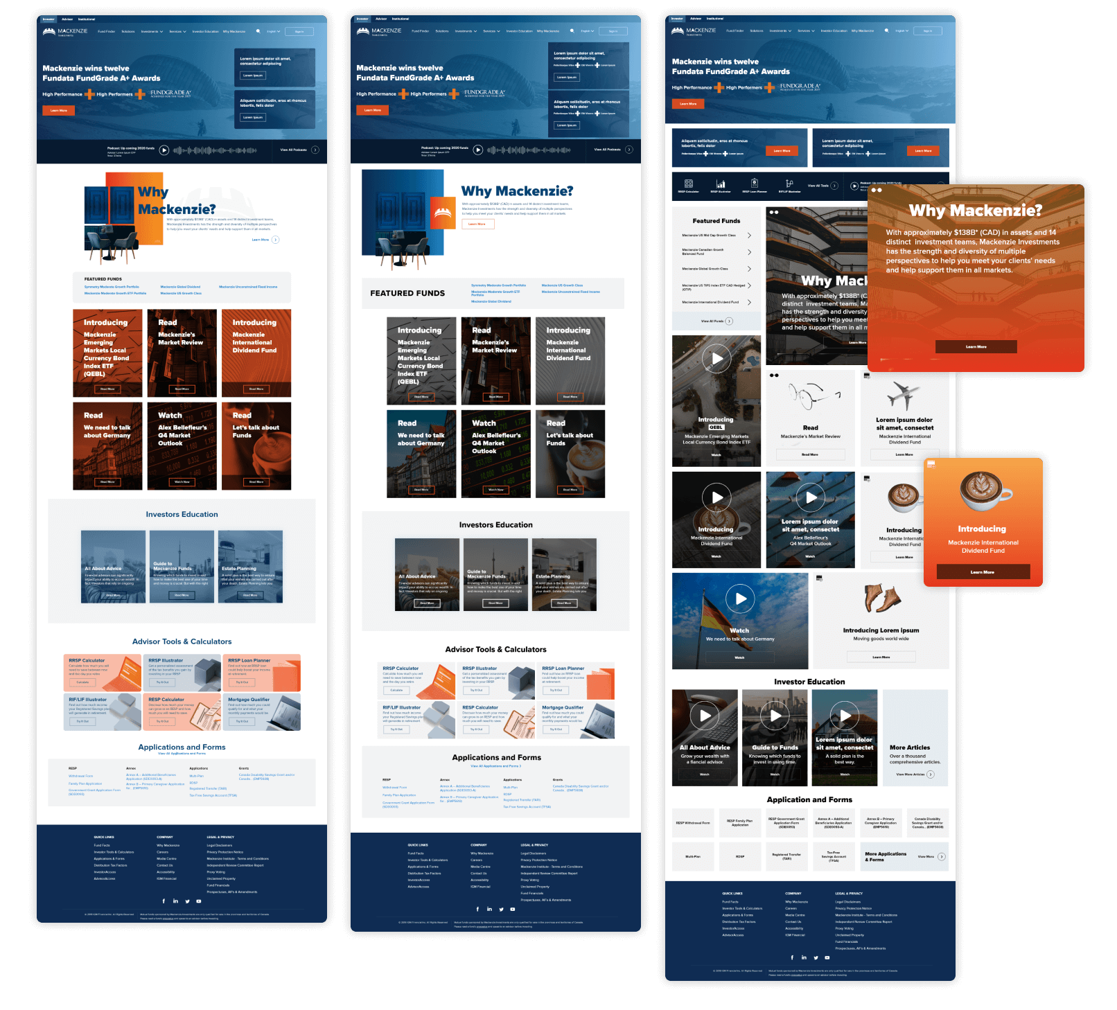
Upon completing the campaign, we recognized the need to break free from the limitations of the orange and blue imagery. We embarked on three distinct explorations, aiming to discover fresh possibilities and bridge identified gaps. In our initial approach, we presented the brand's leadership with options to propel the brand's evolution. This involved either a substantial update or a gradual implementation of transformative enhancements over time. We demonstrated how these approaches could shape the brand's future and create a lasting impact.

Exploration of UI styles
Collaborative design sprints and future capabilities
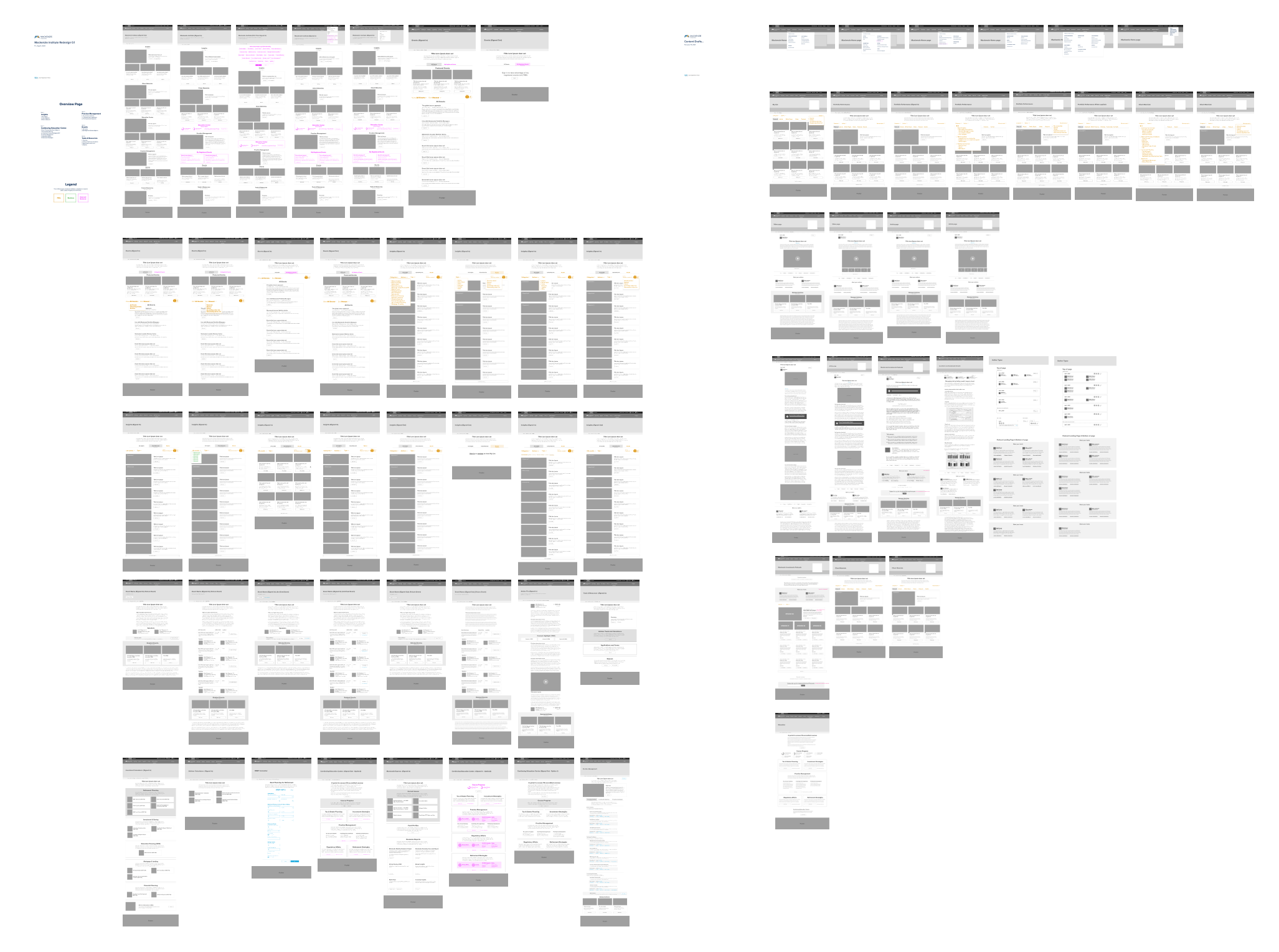
With the brand and business fully embracing the new direction, we found ourselves in a unique collaborative position, engaging in mini design sprints. These sprints served as a platform for us to explore and envision future capabilities that seamlessly integrated into the new UX and UI. Our approach placed a strong emphasis on content and crafting an immersive experience for users. We also identified a significant opportunity in enhancing the logged-in state, enabling us to differentiate ourselves from the competition. By prioritizing education and implementing mechanisms to track user progress towards specific goals over time, we not only improved the user experience but also established a solid foundation for differentiation. This initiative further allowed us to develop a comprehensive user profile and settings center, complemented by the introduction of public forms that could leverage the insights gained through our exploratory efforts.

Wireframes
Design system expansion
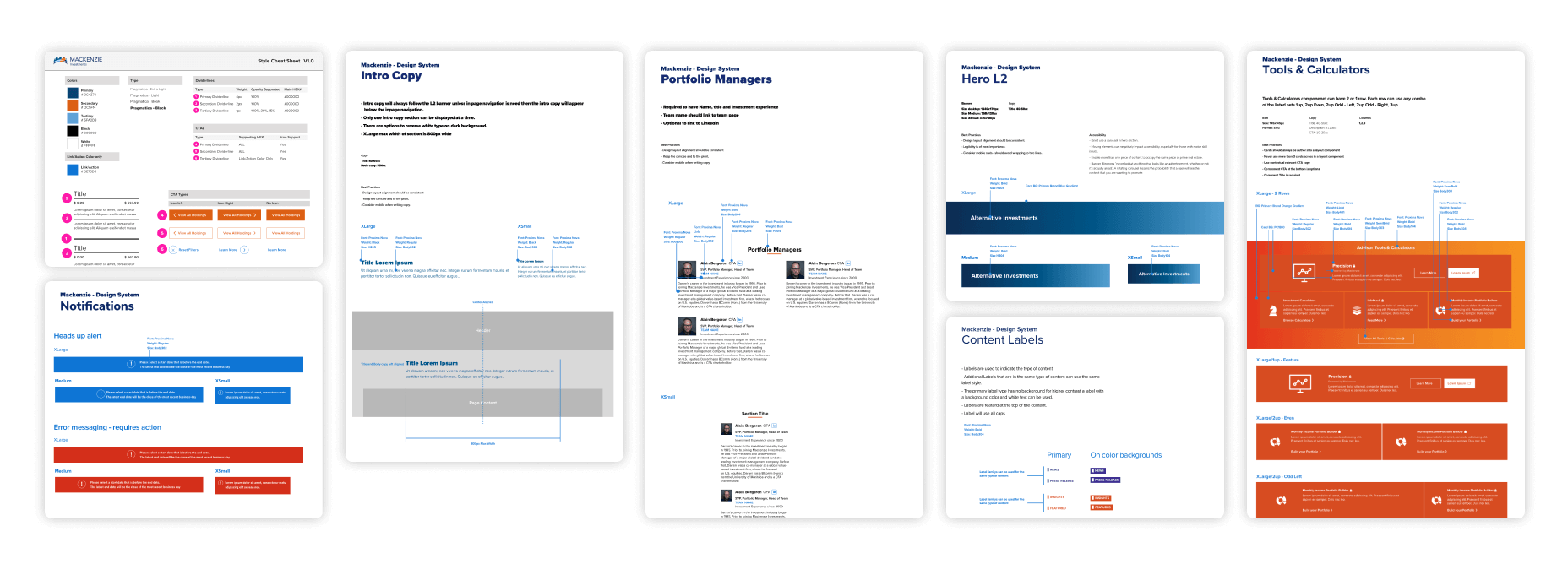
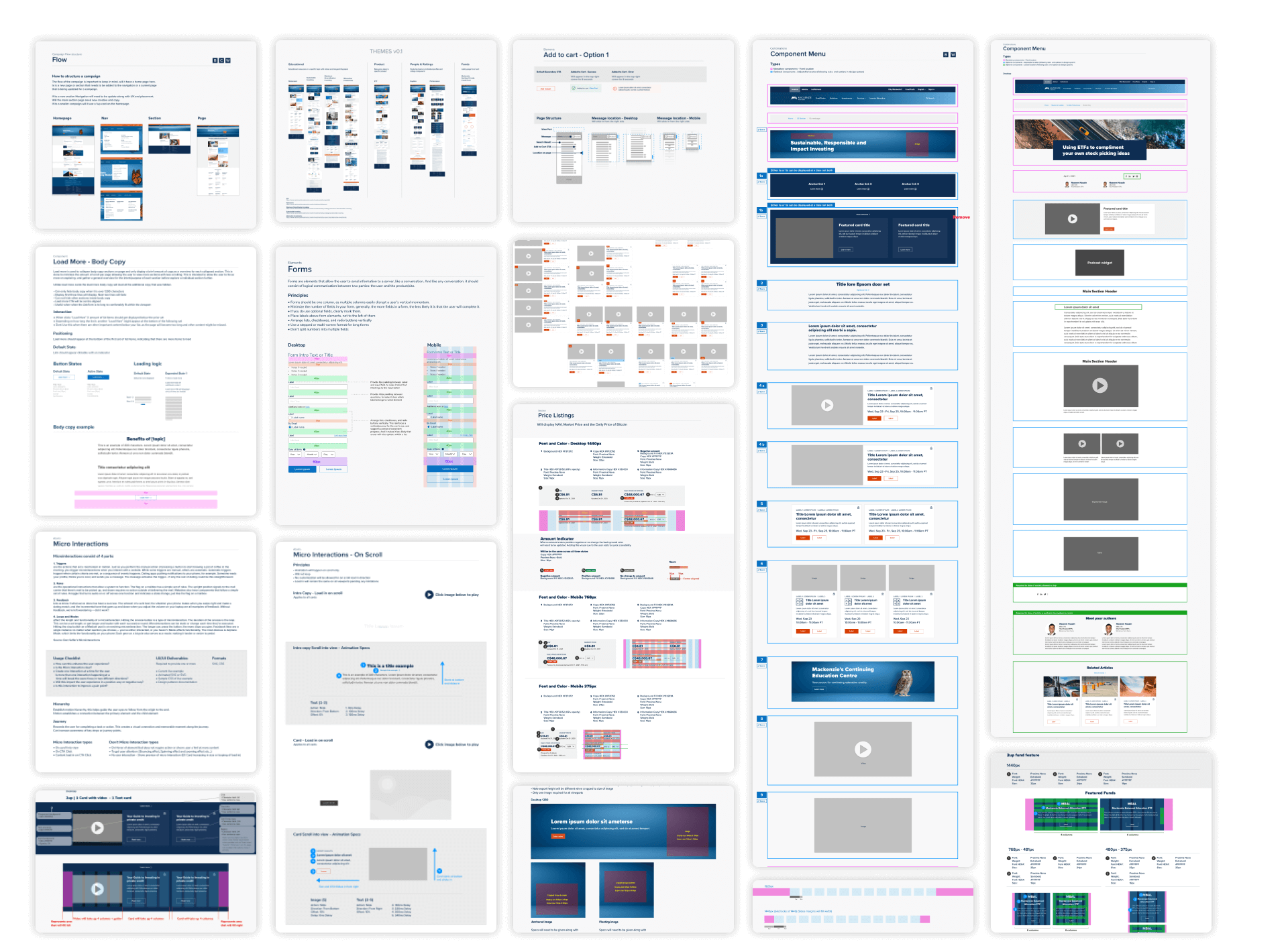
In the present phase, as we concluded certain capabilities, our focus shifted towards expanding our design system. We strategically formulated five distinct content types: Educational, Product, People & Ratings, Articles, and Funds. This categorization allowed us to direct our attention to updating and creating specific components and elements within each category. By adopting this approach, we ensured a comprehensive overhaul of our design system, encompassing both the necessary updates to existing areas and the creation of new components from the ground up.

Design system updates - Sample set
Setting a new standard
By setting a new standard across Mackenzie, established a framework for maintaining and operating a design system in the future. This involved creating patterns and implementing processes that align with UX and UI best practices. Through this strategic approach, we are poised to optimize the design system, ensuring consistency, efficiency, and a seamless user journey across all Mackenzie platforms. Our commitment to upholding these standards will enable us to deliver an exceptional user experience while fostering a cohesive brand identity.

Showcasing UI evolution - Sample set
Creating a solid foundation
With the implementation of a robust foundation, Mackenzie gained the power to effortlessly maintain business-as-usual (BAU) articles and update pages with unprecedented efficiency. The newly implemented system facilitated seamless updates for both components and pages, streamlining the entire process with remarkable ease. This enhanced capability ensured a smoother workflow and improved agility, allowing Mackenzie to stay current and deliver timely updates to its content and pages.
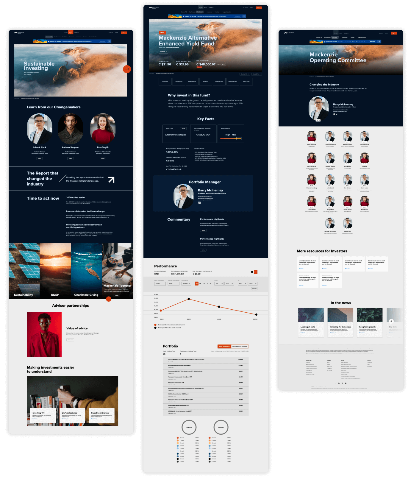
Charting the path ahead
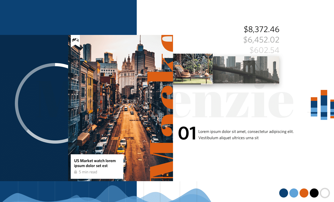
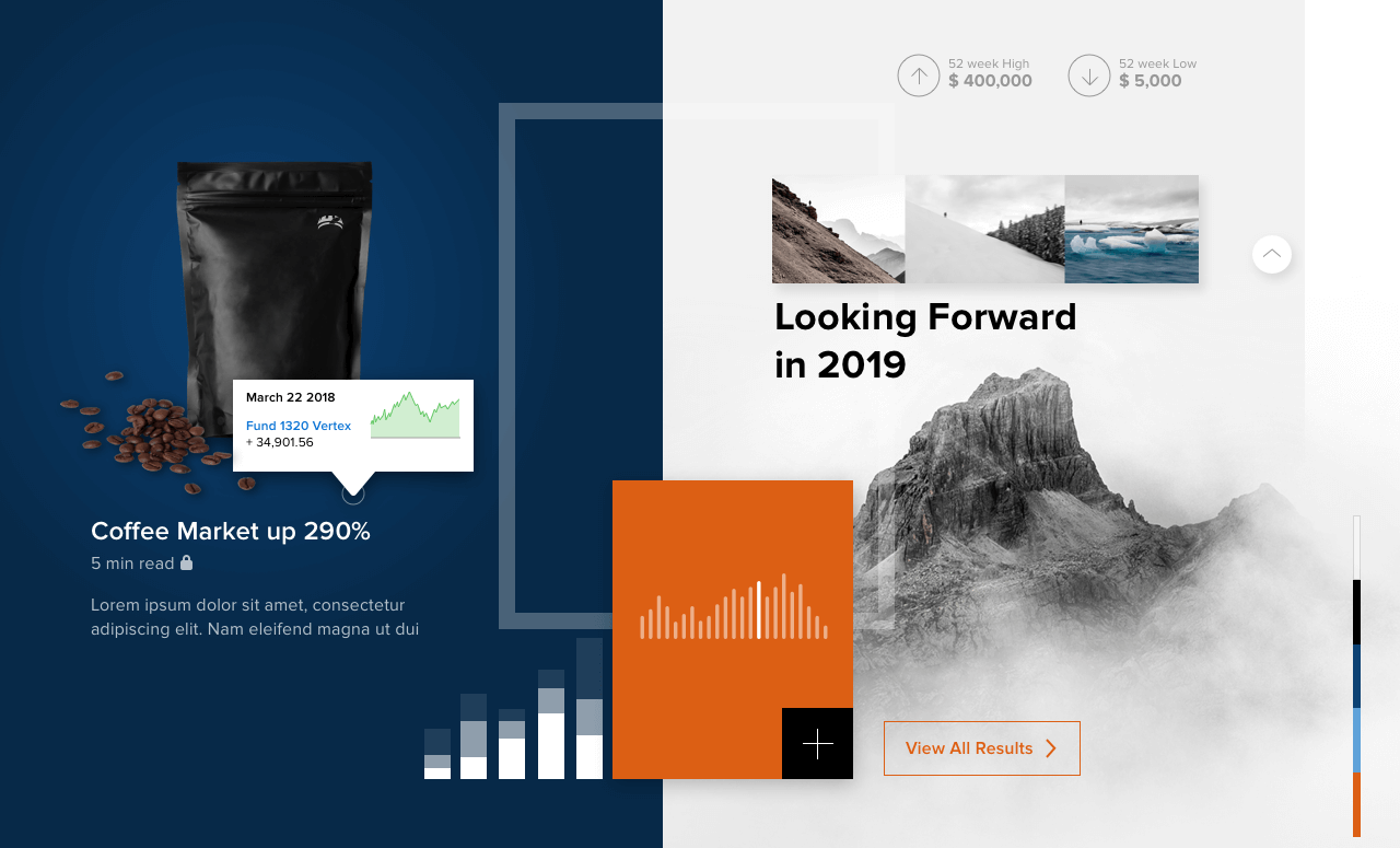
By delving into Mackenzie's evolution in its next stage and incorporating feedback from partners and users gathered over the past few years, we have embarked on a new direction. This fresh approach centers around prioritizing information and showcasing data in a modern and clean manner, serving as a proof of concept for our vision. We aim to create a user experience that is both informative and visually appealing, ensuring that users can easily access and interpret the data they need while enjoying a contemporary design aesthetic.

UI brand exploration
